With people’s preferences changing so quickly and new technologies being introduced all the time, it’s clear that what worked a year ago might not cut it anymore.
In 2025, the focus is shifting toward emails that are not just visually appealing but also engaging and easy to interact with.
I’ve worked on enough email campaigns to know that keeping up with design trends isn’t always simple, but it’s definitely worth it.
In this guide, I’ll share what’s trending and why these ideas matter, so you can create emails that not only look great but also deliver real results.
Configure Your WordPress Website for Email Deliverability
Email design trends are exciting, but none of that matters if your emails never make it to your subscribers’ inboxes.
I’ve learned the hard way that WordPress, by default, sends emails using PHP mail, which isn’t exactly reliable.
Emails often end up in spam folders or fail to send entirely, and that’s frustrating for both you and your audience.
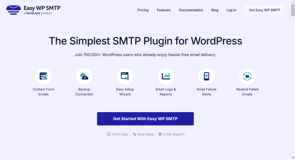
That’s where Easy WP SMTP comes in. This plugin ensures your emails are sent using an SMTP service, which is way more dependable.
I always recommend getting this sorted before focusing on design. After all, the best-looking email doesn’t count if no one sees it.
With Easy WP SMTP, you can confidently move forward knowing your emails are delivered reliably. Install the plugin, add your SMTP settings, and you’re good to go!
Why Email Design Trends Matter
Email design plays a huge role in how your audience interacts with your brand. If your design feels outdated or hard to navigate, it could hurt your credibility and cause users to click away.
The Connection Between Design and User Behavior
Design and user behavior are closely linked. I’ve noticed that people are quick to judge emails based on how they look and function.
If your design isn’t visually appealing or doesn’t adapt to mobile screens, it’s likely to be ignored or deleted.
More than half of email opens happen on mobile devices, so a mobile-friendly design is no longer optional but rather essential.
When emails are designed with the user in mind, they tend to perform much better in terms of clicks and overall engagement.
I’ve tested this myself and found that even small changes, like improving font size or button placement, can make a noticeable difference.
How Brands Use Trends to Stand Out
Some of the most successful brands are those that embrace design trends to stay relevant.
I’ve seen brands use bold typography, interactive elements, or unique color palettes to make their emails pop.
For instance, an eCommerce brand I follow added dynamic content blocks that changed based on user preferences, and their click-through rates went through the roof.
Another example is a travel company that incorporated subtle animations into their emails. The moving elements weren’t overwhelming but added just enough to catch the eye and keep readers engaged.
Email Design Trends for 2025
Email design trends have come a long way, and keeping up with them can make or break how well your emails perform. Let me share some of the trends I’ve noticed that are making a real difference.
1. Minimalist and Clean Designs
If there’s one thing I’ve learned, it’s that less is often more when it comes to email design. Minimalist layouts are becoming a favorite because they’re easy on the eyes and help the message stand out.
They keep the focus on the message by using plenty of whitespace, muted colors, and straightforward typography. For example, the email shared below perfectly embodies this trend.
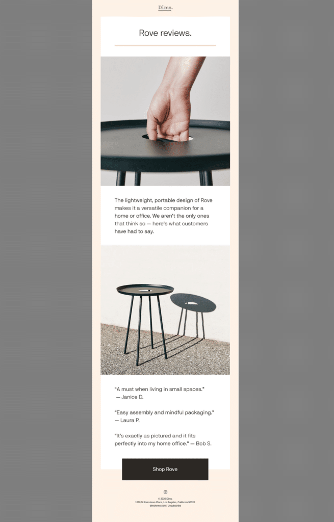
The neutral tones, high-quality product images, and thoughtful use of space all work together to create a sleek, professional look. It’s a great reminder of how effective minimalism can be in highlighting a product or message without distractions.
Emails that stick to one or two focal points, like the example, are more likely to keep the reader’s attention. This design approach is perfect for showcasing reviews, promoting a product, or even sharing an announcement.
When I started applying this trend, I noticed better results almost immediately. Open rates went up, and more people clicked through because they weren’t distracted by unnecessary elements.
2. Dark Mode Optimization
People use dark mode more often now because it’s easier on the eyes, especially at night or in low-light environments.
But designing for dark mode isn’t as straightforward as flipping a switch. It takes thought and testing to make sure your emails look great no matter what mode your audience uses like the example below.
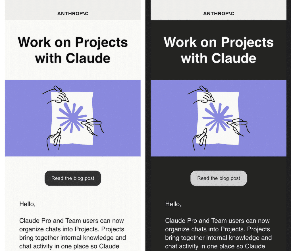
When I started working on emails optimized for dark mode, I noticed a few common problems. Colors that looked great in light mode sometimes didn’t stand out in dark mode.
Logos with transparent backgrounds or black text would disappear completely. It’s little things like these that can make or break how professional your email feels. Here are some tips I’ve learned along the way:
- Use Transparent Images Wisely: Make sure your images, especially logos, have a background that works in both light and dark modes. I like to test logos in both settings before finalizing them.
- Test Your Colors: Stick with colors that contrast well in both modes. For example, light gray text works better than pure white in dark mode because it’s softer on the eyes.
- Use Dark Mode-Friendly Code: If you’re comfortable with coding, you can include special styles in your email’s code that adjust automatically for dark mode users. This step takes a bit of effort but can really pay off.
3. Interactive Elements
Interactive emails are one of the most exciting trends I’ve worked with, and they’ve completely changed the way people engage with content.
Features like carousels, sliders, and gamified elements can transform an email into a more fun and dynamic experience.
The example I’ve shared below perfectly represents how interactivity can work in an email by asking the reader to click on the “Open Me” button in the image.
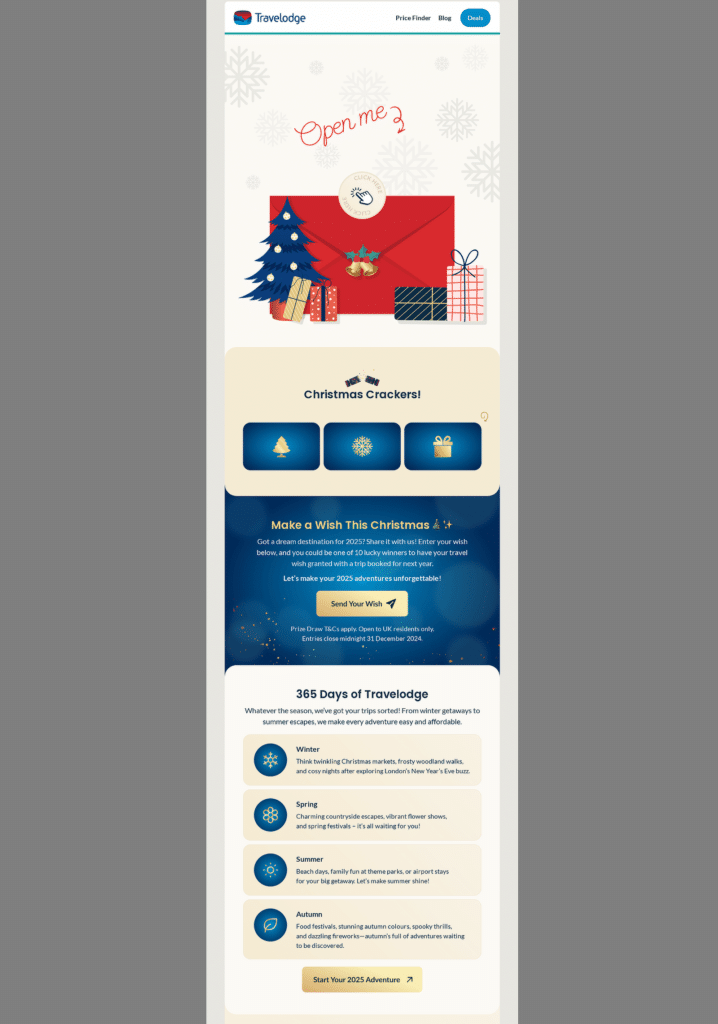
The “Christmas Crackers!” section, where users can click on icons, is also such a clever way to grab attention.
This kind of interactive element can boost click rates because people are naturally curious and enjoy being involved.
4. Personalization Through Dynamic Content
Personalized emails have really changed the way people interact with content. When emails feel tailored to someone’s needs, they naturally grab attention and drive action.
I’ve worked on plenty of campaigns where adding dynamic content, like personalized product recommendations or unique subject lines, made a huge difference.
The example below is a great representation of this. It showcases a curated list of school supplies tailored to the recipient’s interests or needs, based on their previous interactions.
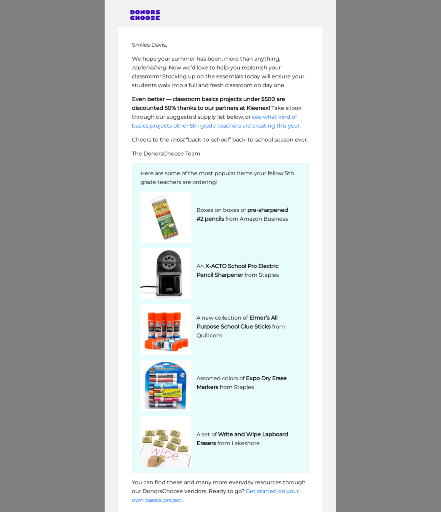
Another approach that works well is to use the recipient’s name in subject lines or mention something specific to their interests.
For instance, the example below is personalized in multiple ways, starting with the recipient’s name in both the subject line and the email body.
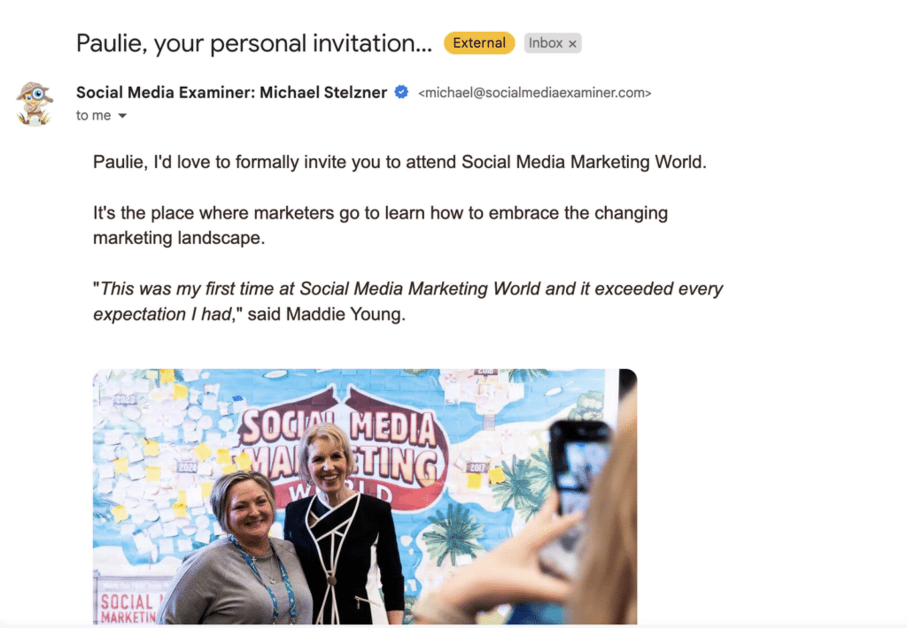
The inclusion of a testimonial adds social proof while reinforcing the value of the event being promoted. It’s as if the sender knows the recipient might need reassurance.
5. Bold Typography and Eye-Catching Headers
I’ve found that when you use bold fonts strategically, your email becomes much easier to scan, which is exactly what people want when they’re quickly checking their inbox.
The example below is a perfect case. The header, “Still considering?”, is short, clear, and uses bold text to immediately grab attention.
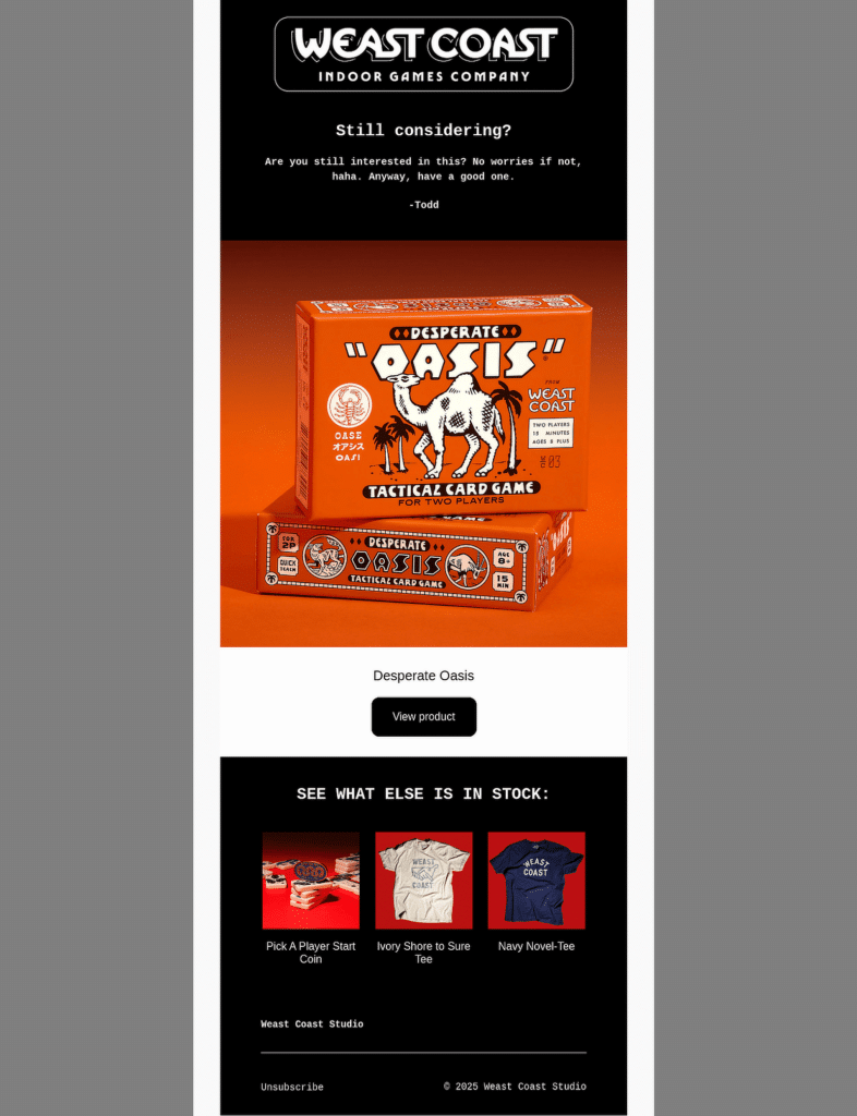
This kind of direct, attention-grabbing header works well because it gets straight to the point without overwhelming the reader.
People tend to skim emails, so bold headers act as signposts, helping them quickly find the information they care about.
As seen in the example, combining bold fonts with high-contrast colors (like black and white or orange and black) can make the text pop even more.
6. Micro-animations for Visual Appeal
Micro-animations, such as small, subtle movements, hover effects, or a gentle bounce on buttons, can grab attention and guide the reader without being overwhelming.
From my experience, adding these little details not only makes emails feel modern but also encourages more interaction. Take a look at the example below.
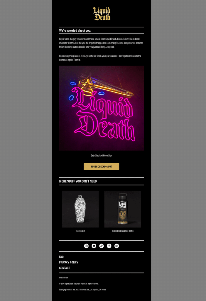
The “Finish Checking Out” button uses a hover effect. When someone moves their cursor over it, the button’s color changes, and it slightly enlarges.
Similarly, the product images have a subtle zoom effect when hovered over, making them feel more dynamic and interactive.
There is also a flicker effect on the “Liquid Death” neon sign, which makes the email stand out and leave a lasting impression on the reader.
7. Picture Walls
Picture walls are one of the most visually engaging trends I’ve seen in email design. They allow you to showcase a variety of images in one layout, creating an immediate impact while telling a story.
I’ve used this approach in campaigns where visuals needed to take center stage, and it always worked wonders for grabbing attention and keeping the audience interested.
The example I’ve shared is a perfect representation of how a picture wall can make an email stand out. It uses a grid layout to feature multiple trainers, giving the reader a sense of diversity and inclusivity.
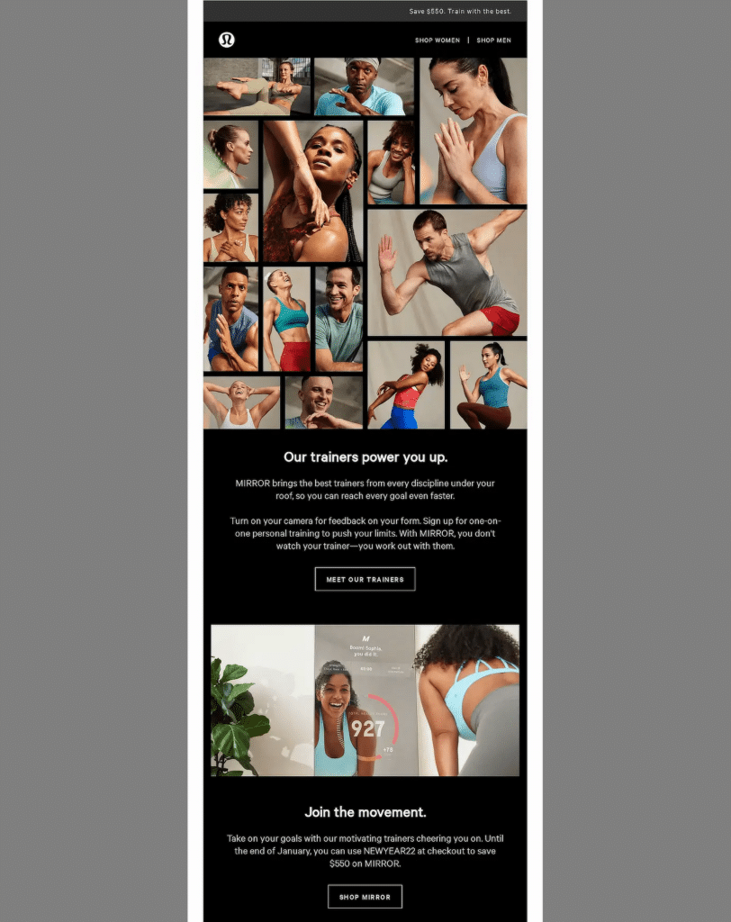
In one campaign I worked on, we used a picture wall to show different customer testimonials. Each image linked to a story, and it created a sense of trust and community.
From my experience, this trend works especially well for fitness, fashion, and lifestyle brands, but it can be adapted for almost any industry with the right visuals.
8. Celeb Cameos
When done well, using a celebrity cameo creates instant recognition and builds trust with your audience.
People are naturally drawn to familiar faces, especially if that celebrity aligns with the values or personality of the brand.
The example below does this perfectly. It features Deion “Coach Prime” Sanders, an American football coach and former player.
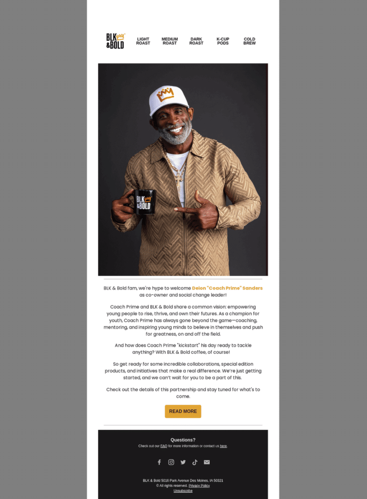
What I like about this approach is how it ties his story, empowering young people, to the brand’s mission. It feels authentic, not forced, which is key when using celebrity endorsements.
From my experience, when you focus on the story behind the cameo, like this email does, it becomes more than just a name drop.
Email Design Best Practices for 2025
The goal of every email is to ensure that your message is understood and prompts action. In order to achieve this, you need to make sure you’re following the best practices out there while trying out different trends.
1. Formatting
Formatting is where it all starts. If an email isn’t easy to read or doesn’t guide the eye naturally, people lose interest fast.
Always keep paragraphs short. No more than two or three sentences. It makes the email feel lighter and easier to read.
Also make sure to break up sections with headers to help people skim the email quickly. I make sure my email headers are bold and clear, so they guide the reader’s eye to important points.
Not to mention, if you’re sharing multiple tips or features, use bullet points instead of writing everything in a long paragraph. They’re easier to scan and don’t overwhelm the reader.
2. Images
When it comes to using images in emails, there’s more to it than just picking something pretty. I’ve learned that the right images can grab attention and guide people to take action.
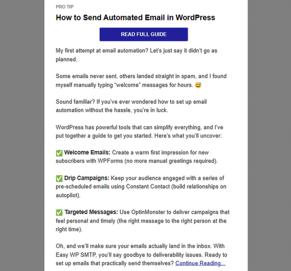
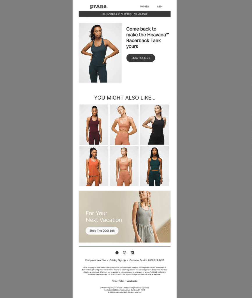
A good rule of thumb is to balance about 60% text and 40% images (unless, of course, you’re sending out product recommendations like the example below that are usually picture-heavy).
I also always include alt text (the text that shows up if an image doesn’t load). This is helpful for accessibility and also ensures the reader knows what the image is about.
Large images can slow down load times, and nobody likes waiting. I always compress images to make sure the email loads quickly, especially on mobile devices.
3. Typography
Typography can make or break an email. Choosing the right fonts makes sure your message is clear and easy to read.
Fonts that aren’t supported by email clients can break your design, so I always stick to web-safe options like Arial, Times New Roman, or Verdana.
Also, keep in mind that font size is really important. I use at least 14px for body text and 22px or larger for headers. This makes the email easy to read on both mobile and desktop.
Lastly, the text should always be easy to read against the background. I stick to high-contrast combinations like black text on white or dark text on light backgrounds.

4. Responsive Design
I’ve seen how frustrating it can be for recipients to open an email that looks great on a desktop but falls apart on a mobile device. Since most people check their emails on their phones, making sure the design adjusts to any screen size is non-negotiable.
I usually design emails with mobile users in mind first. This means using larger fonts, tappable buttons, and a single-column layout that works well on smaller screens. If it looks good on mobile, it’s easy to scale up for desktop.
Not to mention, I’ve also made it a habit to test every email on different devices and email clients. This helps catch any formatting issues early. I’ve found tools like Drip, and its email preview feature very helpful.

5. Call-to-Action (CTA)
I’ve worked on enough campaigns to know that even a perfectly designed email can fall flat if the CTA doesn’t make it easy for people to take the next step.
The CTA should be the most noticeable part of the email. I use bold colors that contrast with the rest of the design so it pops immediately.
I’ve also found that short, action-oriented phrases work best for CTAs. Instead of generic phrases like “Click Here,” I use more specific ones like “Shop Now,” “Read More,” or “Sign Up Today.”
Lastly, Too many CTAs can confuse readers. I always make sure there’s one main action I want them to take, even if I include smaller secondary CTAs.
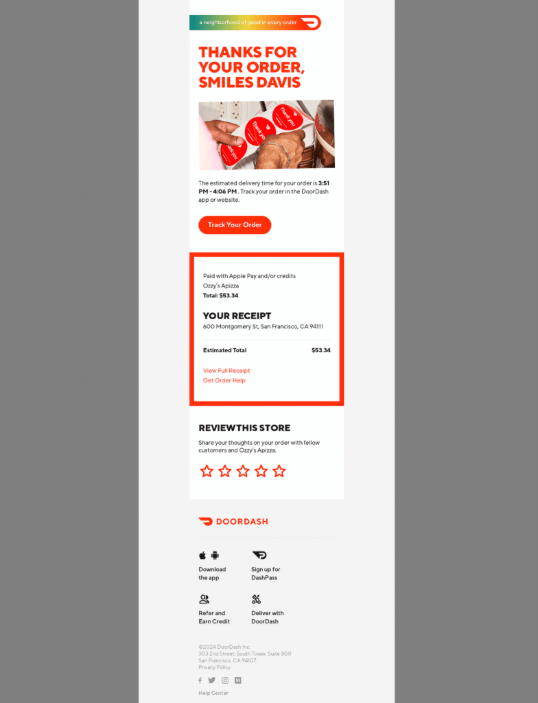
For example, the main button might say “Track Your Order,” while smaller links say “View Full Receipt” or “Get Order Help.”
FAQs — Email Design Trends & Best Practices
Email design trends are a popular topic of interest among our readers. Here are answers to some common queries about it:
Why are email design trends important for marketing?
Email design trends help businesses stay fresh and connect with their audience.
Using updated designs makes emails more engaging, easier to read, and better at encouraging actions like clicks or purchases.
Trends reflect what users expect, making emails feel relevant and effective. And, the same can be said about the user experience of your website.
What role do interactive elements play in modern email design?
Interactive elements like buttons, carousels, or polls make emails more engaging and fun.
They grab attention and encourage users to interact directly within the email, which increases clicks and improves engagement.
How do I optimize my emails for dark mode?
To optimize for dark mode, use images with transparent backgrounds and test your email to ensure text and colors look good in both light and dark modes.
Avoid light-colored text on light backgrounds or dark text on dark backgrounds, and always include alt text for images.
What are the best fonts to use for email design?
Stick to web-safe fonts like Arial, Verdana, or Times New Roman for consistency across devices. These fonts are reliable and ensure your emails look professional and easy to read.
How do I balance text and images in email design?
A good balance is about 60% text and 40% images.
Use images to support your message, not replace it, and always include text so your message is clear even if images don’t load.
What is the ideal size for images in emails?
Images should be under 1MB to load quickly and should have a width of 600 pixels for desktop.
Always test to ensure they look good on both mobile and desktop devices.
That’s it! Now you know everything about email design trends for 2025
Next, Understanding email delivery statuses can make a big difference when it comes to managing your emails effectively.
Check out this guide to learn what email delivery statuses are, why they matter, and how you can use them to make sure your emails land where they’re supposed to.
